 |
|
|
|
91709
0
When creating any company form, more often than not all fields were created in order to be used. Often – when staff are on location or rushing through paperwork submissions can be incorrect or missing altogether. Missing information can create a problem down the pipeline and add unnecessary work and stress later on. Creating the perfect input option for each situation can help alleviate these problems.
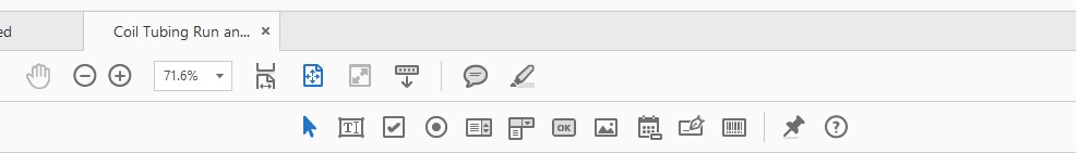
Text Boxes:
These generic text boxes can be used to input any kind of value from words to numbers. They can be single or multi line and you can enable scrolling to enter more information in a limited space. Many form creation programs (Like Adobe DC) allow you to add flair by setting the font, text size and color to any information entered inside the box. Text boxes, like most fields on a digital form can also be made with an outline, solid or transparent depending on your needs. Text boxes are generally the best option for fields that require unique and often changing information such as comments, serial numbers, names and location information.
Date Boxes:
When adding a date selection box to your forms, you enable a feature that brings up a calendar that the user can navigate to select the proper date – be it today’s date or a date in the past or future. Date boxes can be a great alternative to text boxes if you want a specific and consistent format without having to specify “yyyy/mm/dd” or spelling out the full date “September 24, 2018”. Alternately, you can always use at text box for this feature if needed.
Check Boxes:
A check box is a helpful solution when you are using lists in your form or asking to identify a single value. Check boxes are most often used when a user is allowed to select more than one option in a list of options or allowed to exclude information if there is a zero value. Check boxes can sometimes be risky if you need specific “yes or no” answers and there can only be one or the other as they allow users to select multiples. If you require a specific and one or the other response, we suggest using the next option instead.
Radio Buttons:
Radio buttons are the alternative to check boxes. Radio buttons are set up in accordance with another option and only allow you to select one of many. For example, if given a “Yes, No or N/A” question on a form, if you were to select the button corresponding to “no” it would remove the option to have “yes” or “n/a” selected. If you were to change your selection, the selected box would switch between them instead of adding another check. Radio buttons are the best choice when you wish to have only one answer provided.
Drop Down Boxes:
Drop down boxes are pre-populated fields that the user will set-up during the creation of the fillable PDF. When adding a drop-down box, the user will then add in the available responses to the query. These become the only available options to select when filling out the form. You can add flexibility to these fields by making one of the entries a simple space to indicate “nothing” or “blank” or adding an “other” option accompanied by a text box to be used to input the proper value when it is not a given response. It is important to note that adding the blank option and setting that as the default is the best way to keep your fillable forms ready for the next user without unwanted responses. It is also important to note the differences between Drop Down Boxes and List Boxes. Drop down boxes will “hide” the options and values, reducing the size and space needed on a form to only what is selected. Drop down boxes can sit in a single line or space and tuck away when not being interacted with.
List Boxes:
List boxes are much like Drop Down Boxes in function, but instead of auto-hiding the options when not being interacted with, the full length of the list remains visible on the form and your selection is highlighted from this list. You can set up list boxes to only allow one selection from it’s options, or allow users to select multiple values from within. List boxes will take up as much space in size as they are set and as per how much information is within. Some list boxes can be made scrollable to limit the size and space needed.
Action Buttons:
Action buttons are buttons that a user can create and connect a function to. Popular uses for these buttons are to add a button that can easily “Clear” the entire field in one click or “Upload” to prompt a dialogue box to open to access additional files or folders. While this can be set up in a fillable PDF easily, not all forms apps allow the use of action buttons in their software.
Image Fields:
If you want the ability to insert an image directly into the form instead of adding an attachment during submission you may add an image field. This field will stay blank until a user selects it, and will then prompt them to navigate to the image of their choice and insert it. These images will show up in place. You can add multiple image fields and set the image sizes while creating your form. Image fields cannot be used to add other types of documents such as word, PDF etc to a document. Those type documents can be added when submitting a form as an attachment.
Signature Field:
Many forms require the signature of the person who is filling it out, or of a customer who is being interacted with. You can add a signature box to any form to be used in these situations. When interacting with the form from a mobile device or tablet in the field, touching the area will prompt you with the ability to “sign” using your finger or stylus and a copy of that signature will be placed on the form. When interacting with Signature boxes from a PC, you are usually given the option to sign using your mouse, allow the software to generate a digital signature for you by spelling out your name, or by selecting a pre-uploaded version of your signature stored in the software. It is important to note that most Forms Apps can only use signature boxes on mobile devices or tablets using a manual signature.
Mandatory Fields:
When uploading your finished form into the software, you are given the ability to set any field as Mandatory. In doing this, users cannot proceed with submission without having all of the mandatory fields completed or they are prompted to go back and add the necessary values. This is a great way to ensure that important information is not missed, saving you time later down the pipeline.
Would you like to see these features in action? Have a form that would benefit from being made digital? Visit https://cms.chameleonformsapp.com/signup/ to start your free trial and see for yourself the digital difference.
